These visualizations won 2nd place in the 2021 Data Visualization Contest hosted by Northwestern IT Research Computing Services and Northwestern Libraries. Other winners can be viewed here.
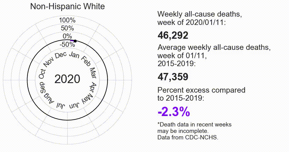
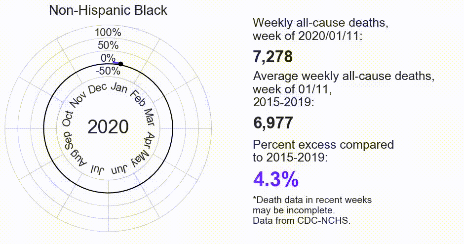
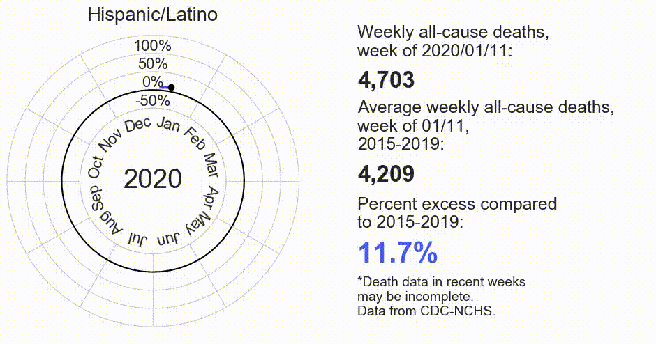
American communities of color have shouldered a disproportionate share of the COVID-19 pandemic’s burden. For instance, at peak, Hispanic/Latino Americans experienced a weekly all-cause death burden 130.9% in excess of previous years. Not all excess deaths are directly attributable to COVID-19—there is emerging evidence that delays in care associated with pandemic-related closures and shortages also contributed to increased mortality among all demographics (see CDC report). The phenomenon of increased death burden among American minority groups reflects a higher COVID-19 disease burden, as well as poorer access to health care services and increased prevalence of comorbid conditions for COVID-19 relative to White Americans.
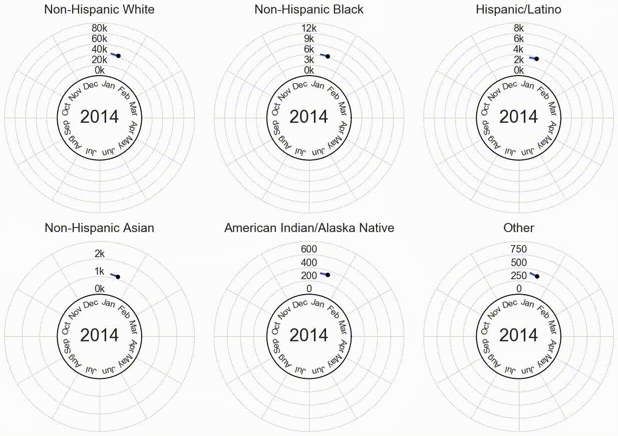
The following visualizations show weekly all-cause deaths by race and ethnicity over time, from 2014 to early 2021.
Data is from the Centers for Disease Control and Prevention National Center for Health Statistics. Names of racial and ethnic groups presented reflect those used by the CDC-NCHS. Data in recent weeks are incomplete—only 60% of death records are submitted to CDC-NCHS within 10 days of the date of death, and completeness varies by jurisdiction. These figures were created in Python with matplotlib and animated with ffmpeg. Code available on GitHub.
Weekly all-cause deaths over time by race/ethnicity:
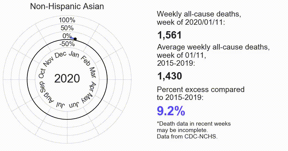
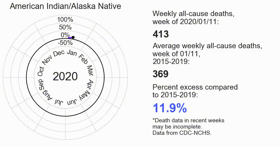
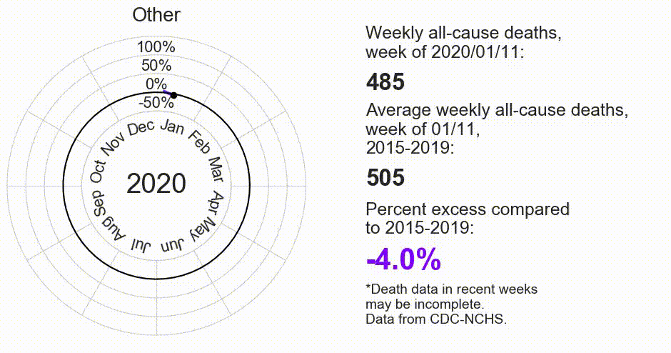
Relative change (percent excess) in weekly all-cause deaths by race/ethnicity, 2020-2021:
This kind of visualization was inspired by Nightingale diagrams, a method for visualizing cyclical data, such as year-over-year trends. See Numberphile’s video on the history and usage of Nightingale diagrams.