[This post was originally published on my blog ]

This post in based on this other one I posted a few days ago, where I’m exploring a new data set about murder rates in the US. I decided to write a plot detailing how to plot a map of said murder rates in the US, but also adding a slider to explore the different years included in the data set.
The data is gathered and published by the FBI, but I’m gonna be using this other version, that I minimally modified to make it easier to use.
Also, I am using this post to practice how to embed my own python code in a way that is useful and looks nice. I am gonna do this by converting the particular snippet of code into html here.
Ok, so, let’s start with the data, which looks like this:
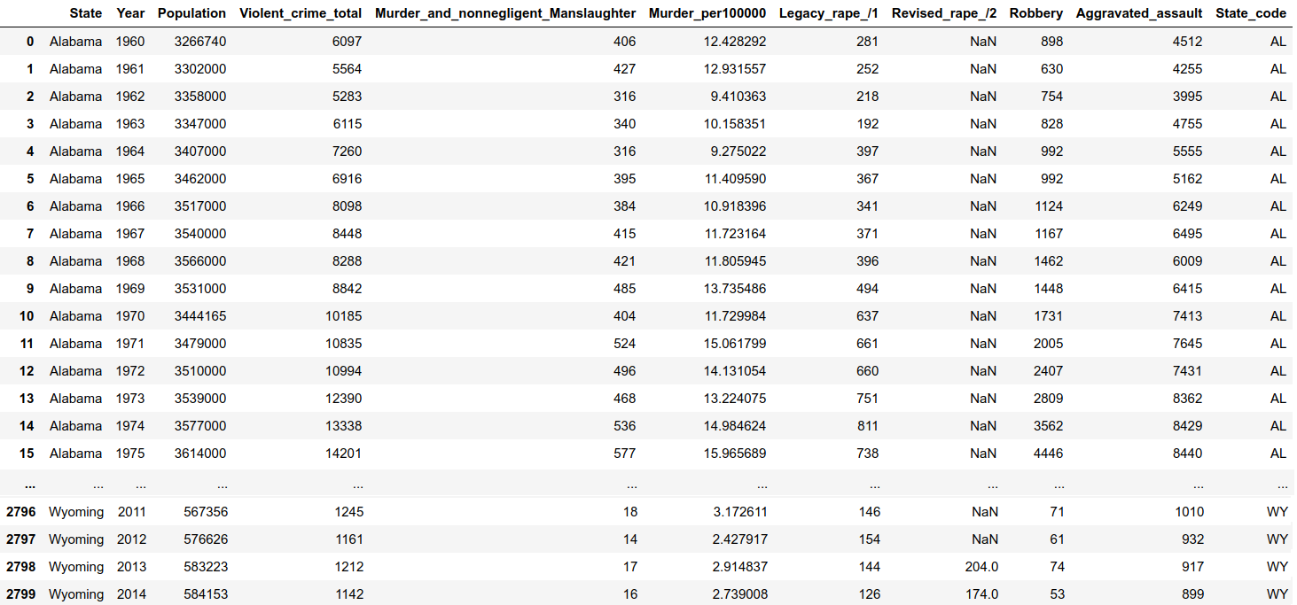
We have one row per year and per state, and in each one of them, we have the population of the state, as well as the total number of violent crimes committed, the breakdown by type of crime, and the murder rate per 100,000 people.
I’m gonna start by plotting a single year of data on a map of the US, and then I’ll build from there.
First, some imports:
import pandas as pd
import plotly
import plotly.graph_objs as goimport plotly.offline as offline
from plotly.graph_objs import *
from plotly.offline import download_plotlyjs, init_notebook_mode, plot, iplotinit_notebook_mode(connected=True)
I load the data file, and select the focus year (I’ll also remove data for District of Columbia, for now):
df_merged = pd.read_csv('../CrimeStatebyState_1960-2014.csv')year = 1960
df_sected_crime = df_merged[(df_merged['State']!= 'District of Columbia' ) &\ (df_merged['Year']== year )]
Then I specify the color scheme for the map plot, and I create a new column that will include the mouse-hovering text for each state:
scl = [[0.0, '#ffffff'],[0.2, '#ff9999'],[0.4, '#ff4d4d'], [0.6, '#ff1a1a'],[0.8, '#cc0000'],[1.0, '#4d0000']] # redsfor col in df_sected_crime.columns: df_sected_crime[col] = df_sected_crime[col].astype(str)
df_sected_crime['text'] = df_sected_crime['State']+'Pop: 'df_sected_crime['Population']'Murder rate: '+df_sected_crime['Murder_per100000']
I decided to go with a red color scale, as it has an almost-intuitive association with violence. But you can pick different color schemes if you prefer. I recommend the color brewer site or the color picker site. In particular, the color brewer site not only gives you the hexadecimal or RGB codes for the colors you like, but also, it suggests pleasant color schemes for a given number of colors, as well as black & white printer-friendly, or color blind-friendly color schemes etc.
The data object for plotting need to be a list of dictionaries set up as follows:
data = [ dict(
            type='choropleth', # type of map-plot
            colorscale = scl,
            autocolorscale = False,
            locations = df_sected_crime['State_code'], # the column with the state
            z = df_sected_crime['Murder_per100000'].astype(float), # the variable I want to color-code
            locationmode = 'USA-states',
            text = df_sected_crime['text'], # hover text
            marker = dict(     # for the lines separating states
                        line = dict (
                                  color = 'rgb(255,255,255)',
                                  width = 2) ),
            colorbar = dict(
                        title = "Murder rate per 100,000 people")
            )
       ]
Then I take care of the layout, create the figure object and I plot it :
layout = dict( title = year, geo = dict( scope='usa', projection=dict( type='albers usa' ),
# showlakes = True, # if you want to give color to the lakes
# lakecolor = 'rgb(73, 216, 230)' ), )fig = dict( data=data, layout=layout )
plotly.offline.iplot(fig)
Or, if you want to plot it in a different window on your browser:
offline.plot(fig, auto_open=True, image = 'png', image_filename="map_us_crime_"+str(year),
             image_width=2000, image_height=1000,
             filename='/your_path/'/span>"map_us_crime_"str(year)+'.html', validate=True)
This is the output:
We clearly observe how in 1960, the South was a considerable more violent region of the US than the North. It would be interesting to see how that pattern changes over time.
Thus, now we make the necessary modifications to add a slider to go over the different years in the data set. The main conceptual differences are that now the data object now is going to be a list of dictionaries, and also that I need to create a ‘steps’, and a ‘slider’ object that will go as an argument for the layout command.
After loading the data set and defining the color scheme, I create an empty list for the data, that I will populate with dictionaries (one per year):
#### input data set:
df_merged = pd.read_csv('../CrimeStatebyState_1960-2014.csv')### colorscale:
scl = [[0.0, '#ffffff'],[0.2, '#ff9999'],[0.4, '#ff4d4d'], \ [0.6, '#ff1a1a'],[0.8, '#cc0000'],[1.0, '#4d0000']] # reds
### create empty list for data object:
data_slider = []
Now, I populate the data object, one dictionary per year that will be displayed with the slider, by iterating over the different years in the data set:
#### I populate the data object

for year in df_merged.Year.unique():

    # I select the year (and remove DC for now)
    df_sected_crime = df_merged[(df_merged['State']!= 'District of Columbia' ) &  (df_merged['Year']== year )]

    for col in df_sected_crime.columns:  # I transform the columns into string type so I can:
        df_sected_crime[col] = df_sected_crime[col].astype(str)

    ### I create the text for mouse-hover for each state, for the current year
    df_sected_crime['text'] = df_sected_crime['State'] +
    'Pop: ' /span> df_sected_crime['Population']'Murder rate: '+df_sected_crime['Murder_per100000']

    ### create the dictionary with the data for the current year
    data_one_year = dict(
                        type='choropleth',
                        locations = df_sected_crime['State_code'],
                        z=df_sected_crime['Murder_per100000'].astype(float),
                        locationmode='USA-states',
                        colorscale = scl,
                        text = df_sected_crime['text'],
                        )

    data_slider.append(data_one_year)  # I add the dictionary to the list of dictionaries for the slider
Next, I create the ‘steps’ and the ‘slider’ objects:
## I create the steps for the slider
steps = []
for i in range(len(data_slider)): step = dict(method='restyle', args=['visible', [False] * len(data_slider)], label='Year {}'.format(i + 1960)) # label to be displayed for each step (year) step['args'][1][i] = True steps.append(step)## I create the 'sliders' object from the 'steps'
sliders = [dict(active=0, pad={"t": 1}, steps=steps)]
Finally, we create the layout, and plot it (both on the notebook and as a separate browser window):
# I set up the layout (including slider option)
layout = dict(geo=dict(scope='usa', projection={'type': 'albers usa'}), sliders=sliders)# I create the figure object:
fig = dict(data=data_slider, layout=layout)# to plot in the notebook
plotly.offline.iplot(fig)# to plot in a separete browser window
offline.plot(fig, auto_open=True, image = 'png', image_filename="map_us_crime_slider" ,image_width=2000, image_height=1000, filename='/your_path/map_us_crime_slider.html', validate=True
And that’s it! See how it looks:
As we slide from one year to the next, we observe how the South-North differences get less accentuated. Note also that the color scale is relative to each year (that is something I’ll fix later on).