Pretend you’re a researcher and you’ve got some data that you want to try to fit to an equation. What’s the best way to do it? On one hand, experts say that it’s best to keep it simple with linear regression. In many cases, a linear regression model like ordinary least squares is enough to discern any relationships in the data, and the data is rarely going to fit perfectly no matter how many extra variables and polynomials you add.
On the other hand, simple regression is boring and lines are for squares. Curves are in! If you want to make it in a major journal, you better make sure your paper is showing off its curves. That’s what Yuyu Chen et al did in their paper on environmental policy, air pollution, and life expectancy in China. They took their data fit and made it work and it got them the cover of the August 6th issue of PNAS. That’s how you get ahead in the modelling business, girrrrrrl.
Sorry, I got possessed by a supermodel there for a bit. Anyway, the paper by Yuyu Chen et al is a prime example of data fitting gone cray-cray. To give a quick synopsis of their paper, for 30 years in the mid-to-late 20th century, the Chinese government enacted a policy that gave free coal to citizens to use for winter heating. However, they only provided free coal to people that lived north of the Huai River, China’s equivalent of the Mason-Dixon line. Today, China has a well-documented problem with air pollution. Chen et al theorize that this Huai River policy has caused the air quality in China to be poorer in the north than in the south, leading to a geographicial difference in life expectancy.
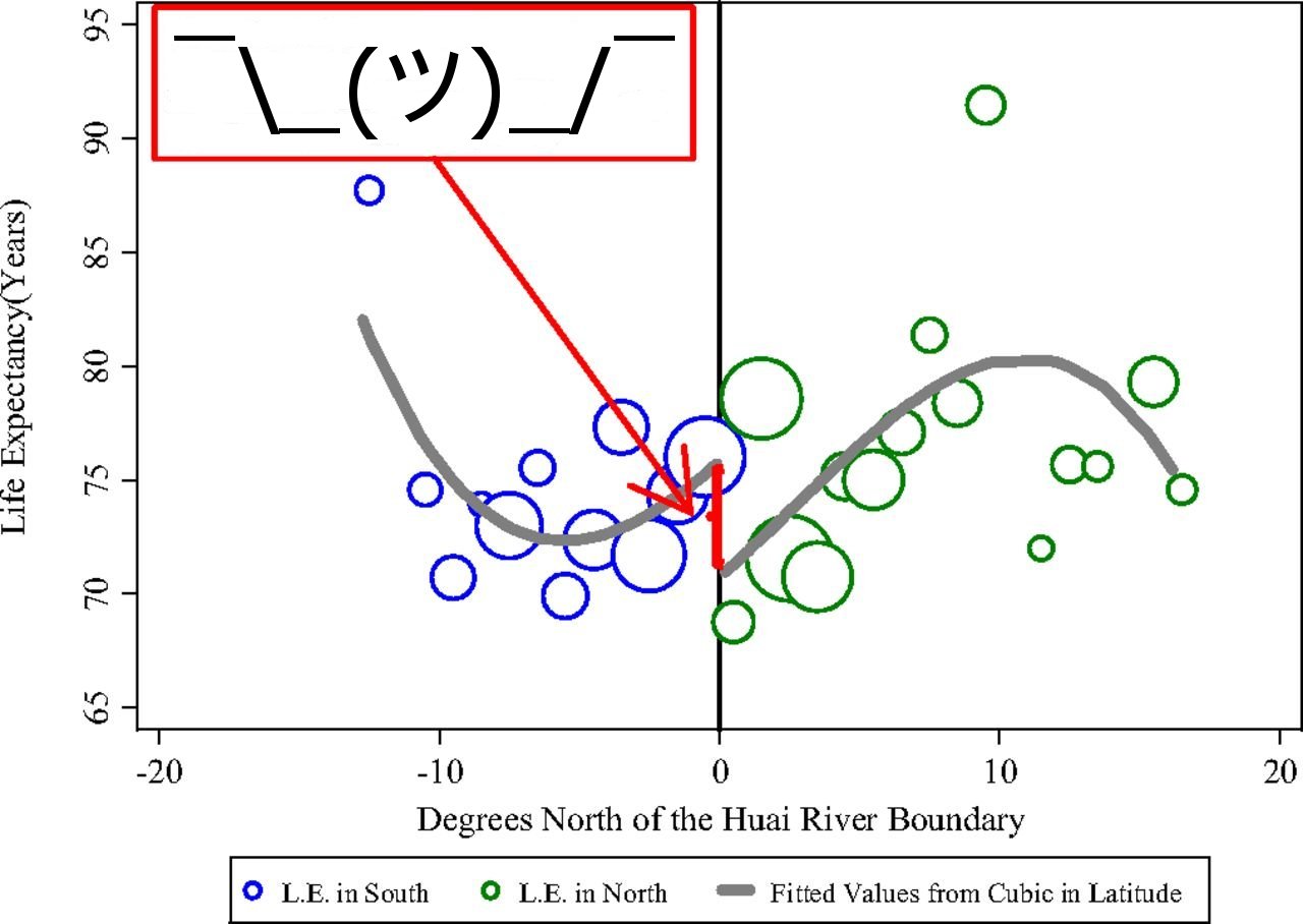
This actually sounds like a really interesting paper that highlights the unintended long-term consequences of government policies. Moreover, Chen et al were able to obtain mortality data of people from various Chinese cities in order to test their hypothesis. All they needed to do was see if there was a significant difference in air pollution and life expectancy for cities north of the Huai River compared to cities south of the Huai River. Instead, Chen et al decide to develop a model that expresses life expectancy as a function of degrees of latitude. This makes thing a bit more complicated, but it’s still pretty reasonable for analysis. Then the researchers decide to incorporate the degrees of latitude in a cubic polynomial. They do this because, well, why not, y’know? But they don’t stop there, oh no. Chen et al choose to add an indicator variable to the model that equals 1 if a city is north of the Huai River. This is the regression analysis equivalent of putting too much cheese in the pizza crust, as location was already present in the model in the form of degrees of latitude. The researchers put it all together, and one least-squares regression later, we get this:
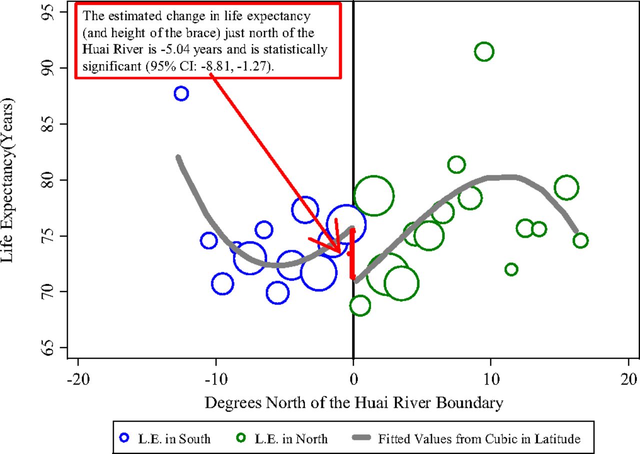
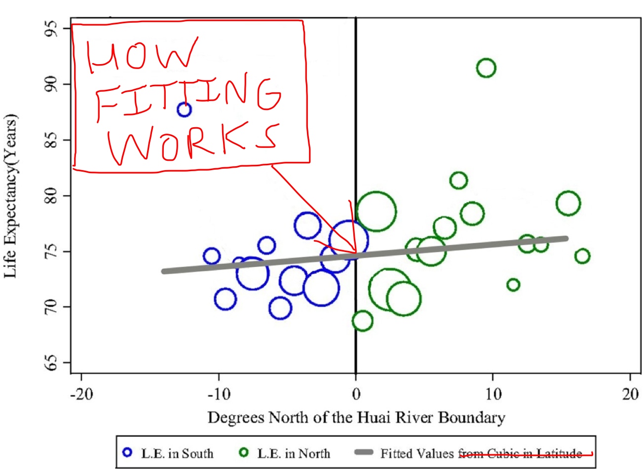
Chen et al say that this figure demonstrates that there is a 5-year difference in life expectancy between north and south China. I say it’s a fantastic demonstration of over-fitting and over-complicating a model in order to give your figure a wavy line, wait, no, two wavy lines. It also allows the researchers to claim that the north has a lower life expectancy because of the air pollution, despite the fact that their line of fit implies that you’ll live longer if you reside 10 degrees north of the river than 10 degrees south of it. Of course, you’d actually have to do something silly like look at the plot for more than 5 seconds in order to discern that, something I’m guessing the peer-reviewer failed to do. (Amazingly, this PNAS paper wasn’t contributed. I know! I’m shocked too!) Here’s how the plot should look:
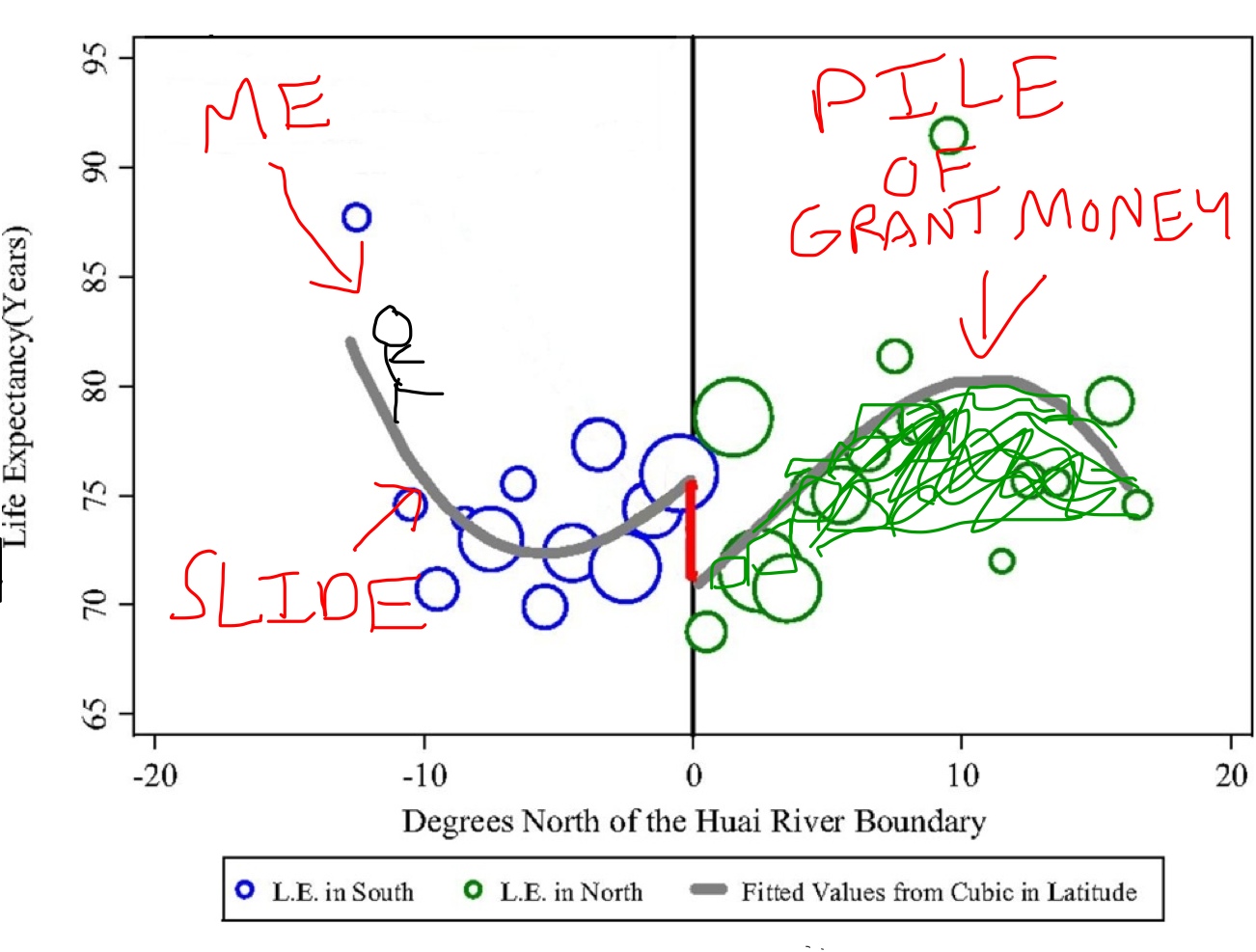
Of course, if they did this, Chen et al wouldn’t get the result they wanted and then they’d have no shot at the PNAS cover. Like I said before, straight lines are boring, it’s curves that take you to the heights of academia. Chen et al know this. Just take a look at the figure that appears in their penultimate draft:
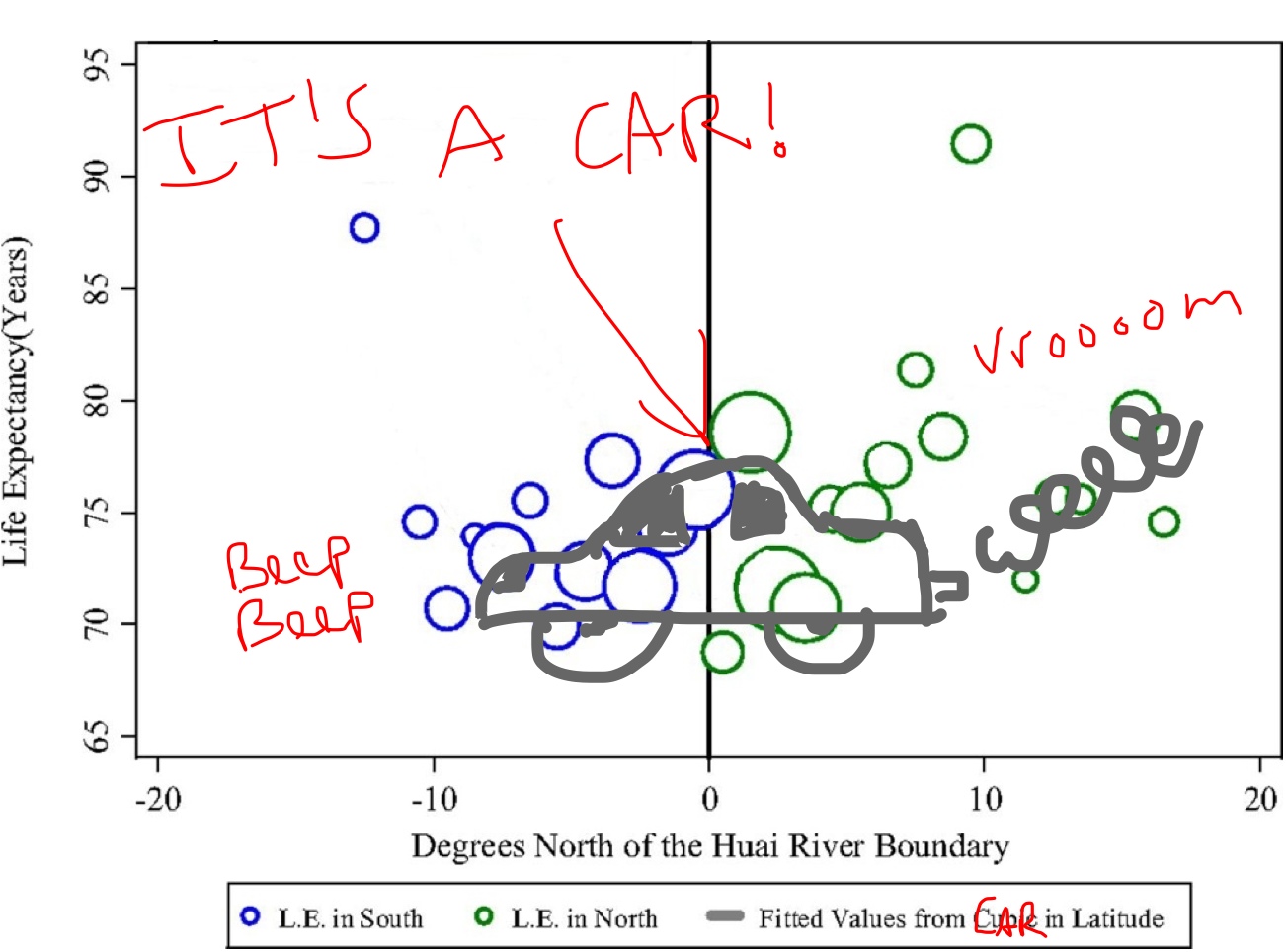
This may or may not be an actual figure that the researchers made. The same goes for this one:
All in all, this was a perfectly serviceable paper that unfortunately was artificially transformed in order to make it more interesting. Complicated models may be exciting to look at, but there’s rarely any real motive to use them. Keep it simple, because that’s how you find the real insights. Otherwise, you might as well just say this:
— Max