For the last couple of years, I’ve been using Plotly to create visually appealing interactive plots. You can create an account at plot.ly and then create and edit your plots from their online platform (they also have a premium option with extra features), but I prefer using Plotly offline, just as if it was another Python package, from a Jupyter notebook. By the way, Plotly also supports other languages, such as R or MatLab.
Plotting with Plotly works very similarly to using Python’s MatPlotlib package. However, you can create not only png or eps figures as output, but also an interactive version in html that can be opened with any browser (or embedded in a post just like this one). It is also nicely compatible with Pandas data structures. You can find a lot of examples of snippets of code to create different plots here. Also, below are some examples of mine from different research projects. You can click & drag to zoom in. Click the home icon on the top right to reset the axis. Hover over the points to see specific values. Click the camera icon to download the plot as a png file.
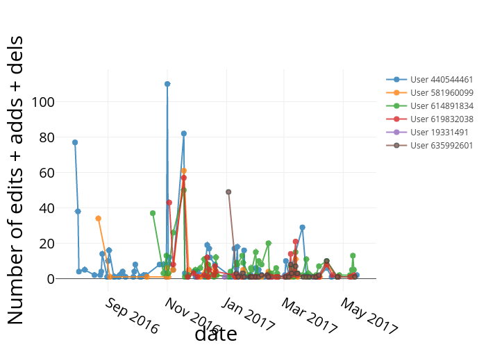
This is a time series for the total online activity (file adds, edits and deletes) of the different users of one shared folder on a commercial, online collaboration platform:
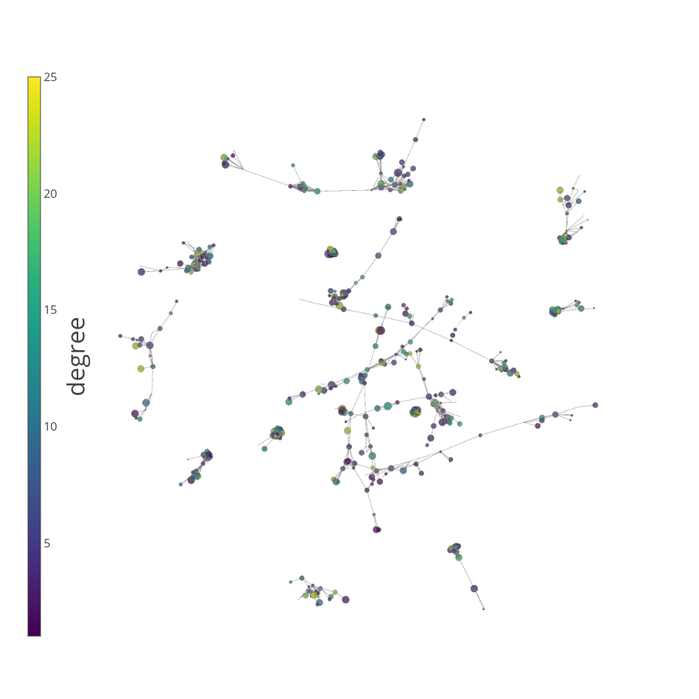
This is a 3D representation of the network of academic collaborations (links) among scholars (nodes) in and Ivy League university. The colors correspond to the degree (number of collaborators) of each person (the specific spatial location doesn’t have any meaning, just the connections among individuals). Click & drag to spin it around, scroll to zoom in/out of the structure:
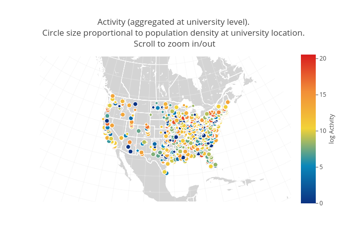
This one is a map displaying the location of universities in the US. The colors correspond to the level of online collaboration activity (logarithm of the number of adds, edits and deletes, aggregated at the university level), while the size of the circle is proportional to the number of academics at a given university. When hovering over a point, you can see information about that university (name, location, rural/urban index for the location, …).
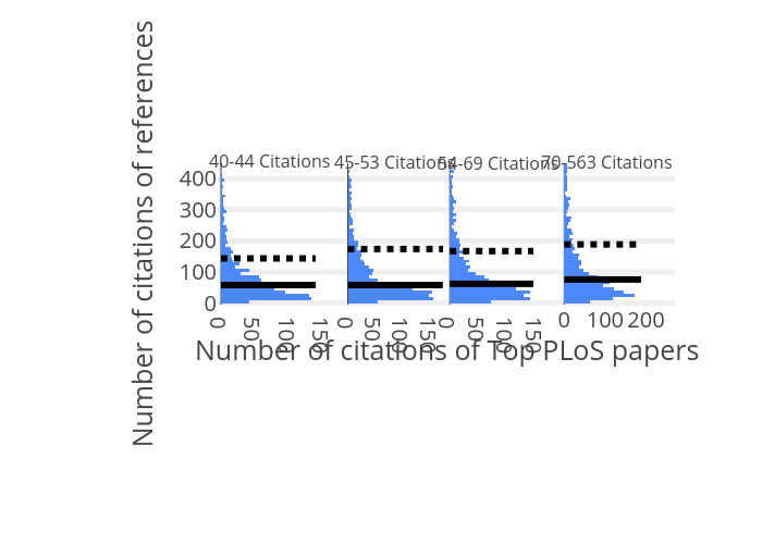
This one displays multiple histograms at once, for the number of citations accrued by four different groups of papers. In particular, these papers are references contained in a collection of (top) PLoS papers (Public Library of Science), and I separated them into four categories, according to the number of citations accrued. The full (dotted) lines indicate the medians (means) of the corresponding distributions.
This bar plot is showing the result from a bootstrapping procedure. It aims at determining whether the amount of ‘Top’ or ‘Bottom’ references, used by ‘Top’ and ‘Bottom’ papers is what could be expected from a random selection of available references at the time of publication (Null Model). Here, I define Top (Bottom) as the 10% most (least) cited papers or references in the set. We find that top papers use a higher-than-expected fraction of top references (pink bars on the right), and lower-than-expected fraction of bottom references (blue bars on the right). The exact opposite is true for bottom papers and their references. Click & drag to zoom in.

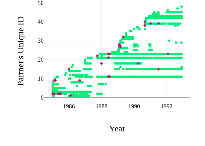
Time series for transactions between a company and all its business partners. I color-code successful transactions in green, and failed ones in red.
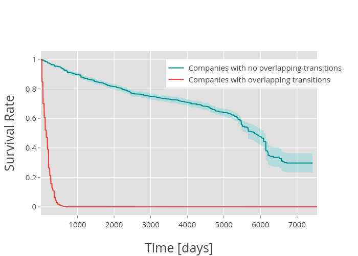
This one displays two survival curves as a function of time (hover to see specific values). In particular, I’m modeling the estimated probability of the next business transaction being successful at a given time for those companies that have multiple transactions going on at the same time (red), or those that do not (blue). The color shadows correspond to the 95% confidence interval:
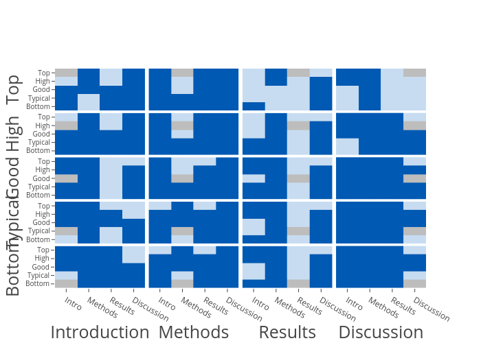
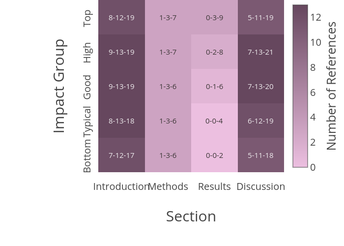
In this heatmap I represent the number of references included in each one of the typical sections of a PLoS paper (X-axis), but also separating the set of papers into categories, according to the number of citations they obtained after 10 years (Y-axis). The numbers in each cell correspond to the 25% percentile-median-75% percentile
Finally, this is a compact way of visually displaying the p-values from multiple pairwise comparisons between the distributions of different subsets of data (for example, if I had a plot similar to the previous one, and I wanted to compare the distribution of values from one cell to all other cells in that plot).
I color-coded the pvalue from the MannWhitney U test: dark blue represents anything significant (below a 0.0001 threshold adjusted by Bonferroni multi-comparison testing for 20 subsets), light blue corresponds to non-significant comparisons (grey rectangles would correspond to self-comparisons).