Today, I want to talk about some data interpolation I had to do recently.
As part of a project of mine, I had to deal with US census data. As you probably know, the US census collects data on many aspects of US society (population, education, income, race, and many others…), but it does it once every 10 years. However, for my particular research, I would like to have yearly values for the population of some cities.
Both interpolation and regression can be used to predict unobserved values, but the basic different between them is that, when you do a regression (let’s say a linear one), you use all your data points to find the line that minimizes the distance to all points, and you are also interested in the functional form (the value for the slope and the intercept in this case). It is also common to keep the number of parameters as low as possible (you don’t choose a quadratic form if a line will do).
In the case of interpolation, you force the function to go exactly through the data points you have (that is, you assume that the points you have are the “true values”), and you use them to infer what the intermediate values would be. It is common to use an (N-1) order polynomial for interpolating N data points (remember that a N-1 order polynomial will have N-2 maxima and minima). You can also use a piece-wise linear interpolation (that is, linking each point with the next with a straight line), or a piece-wise cubic interpolation: that is, if you have let say 20 points, you don’t use a 19 order polynomial, but instead, use 4 points at the time to get a piece-wise cubic fit (this avoids getting a fit with too many maxima and minima). These are decisions that you have to make depending on your needs and the specifics of your data.
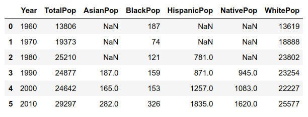
As an example of how US census data looks like regarding population and race, let’s take one single city. This is the raw data:
Note that until the 1990’s, some minorities were not even recorded separately!
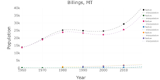
This is a simple scatter plot of the same data:
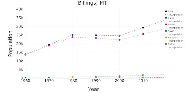
To obtain the estimated values of population for intercensal years, I’ll interpolate using this data. Let’s start with linear interpolation, that is, assuming that the behavior for the years between two data points is just linear:
To do the interpolation, I used the Scipy function interpolate.interp1d. Further down in this post I’ll share my code, but let’s keep exploring.
In fact, using the same function, I can also extrapolate beyond my data, to get the estimates after 2010:
Note that in the previous cases, because data for some minorities was not even recorded before 1980 or 1990, I have chosen to keep the corresponding missing values. I could have also extrapolated the past… although in that case, the sum of the different sub-populations wouldn’t add to the total recorded by the US census, which is something to keep in mind and correct appropriately.
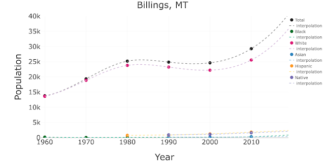
For the sub-populations that have 6 or 7 data points (Total, Black and White), I may want to consider a more sophisticated type of interpolation such as cubic, which will make the curves look smoother. In the case of sub-populations that only have 3 or 4 data points it is not advisable to do so because they could display funny behaviors in the beginning or end of the time series (more on this later).
This would be the result with cubic interpolation/extrapolation for the Total, Black and White series, and linear for the rest of the series:
In case you want to use it, now I’m sharing and commenting the code I wrote for this example:
Let’s assume that you have the original US census data that I showed at the very beginning, for one city, in a pandas data frame called df_census_city.
First I defined some variables to customize the type of interpolation/extrapolation:
kind_interpolation = ’cubic’  # cubic or linear
flag_extrapolate = ’yes’      # yes or no
Remember that you can create HTML code from a snippet of your Python code using hilite.
Then I list the different sub-populations that want to interpolate, and I define some nice colors for the different series:
list_populations = [’TotalPop’,’BlackPop’,’WhitePop’,\
’AsianPop’,’HispanicPop’,’NativePop’]list_colors = [’#252525’,’#969696’,’#006d2c’,’#66c2a4’, ’#dd1c77’,’#d4b9da’, ’#3182bd’,\ ’#9ecae1’,’#fe9929’,’#fee391’,’#756bb1’,’#bcbddc’]
Then, I loop over the different populations, and I define for each one a trace for the data and another one for the interpolated data (I do this by calling a little function I wrote, see below):
data = []

cont_colors = 0

for population in list_populations:

    ### the actual data
    x = np.array(df_census_city[’Year’].tolist())
    y = np.array(df_census_city[population].tolist())

    ### the interpolation
    x_interpolate, y_interpolate = get_x_y_inter_extrapolation (df_census_city,\
 ’Year’, population, kind_interpolation, flag_extrapolate)

    ############# traces for plotting:

    #### the actual data
    trace1 = go.Scatter(
        x = x,
        y = y,
        name = col_y.replace(’TotalPop’,“Total”).replace(“Pop”,”“),
        mode = ’markers’,
        marker=dict(
            color = list_colors[cont_colors],
            size = 20)
    )
    data.append(trace1)

    ### the interpolated data
    trace2 = go.Scatter(
        x = x_interpolate,
        y = y_interpolate,
        name=’ interpolation’,
        mode = ’lines’,
        line = dict(
            color = (list_colors[cont_colors+1]),
            width = 4,
            dash = ’dash’)
    )
    data.append(trace2)

    cont_colors +=2
Now I take care of the layout for the figure and I plot it (with Plotly):
layout = dict( title = “Billings, MT”, titlefont=dict(size=55), xaxis = dict( title = ’Year’, range = [1959,2019], titlefont=dict( size=55,), tickfont=dict(size=40, ), ), yaxis = dict( title = ’Population’, range = [0,40000], titlefont=dict( size=55,), tickfont=dict( size=40, ), ), legend=dict( x=1, y=1, font=dict(size=25,), ), margin=go.Margin( l=250, # r=50, b=150, #t=100, #pad=80 ) )fig = dict(data=data, layout=layout)
plotly.offline.iplot(fig)
And this is the customized function I wrote for interpolation:
def get_x_y_inter_extrapolation (df_census_city, col_x, population,\
 kind_interpolation, flag_extrapolate):

    min_year_interpolate = 1960
    max_year_interpolate = 2019

    ### i remove the rows with nans
    df_non_NANs = df_census_city[df_census_city[population].notnull()]

    min_year_data = df_non_NANs[col_x].min()
    max_year_data = df_non_NANs[col_x].max()

    x = np.array(df_non_NANs[col_x].tolist())
    y = np.array(df_non_NANs[population].tolist())

    len_y = len(y)

    #### if i only have 3 or 4 points,
    # the kind of interpolation should be linear, not cubic
    if len_y < 5:
        kind_interpolation = ’linear’

    #### it returns the interpolation function, f
    f = interpolate.interp1d(x, y, kind=kind_interpolation, fill_value=’extrapolate’)

    #### i obtain the x and y interpolated values using the f function
    x_interpolate = np.arange(min_year_interpolate,max_year_interpolate+1,1)
    y_interpolate = f(x_interpolate)

    ##### i overwrite the values that are outside min-max years in my data
    if flag_extrapolate == ’yes’:
        for i in range(len(y_interpolate)):
            year = x_interpolate[i]

            ##### if i want to preserve the missing values for
            # the early years for minorities series
            if  year <  min_year_data  :
                y_interpolate[i] = np.nan

           ####  if i don’t want to add values (nor zeros) before or after the actual
           # min /max years in a given series
           #if year >  max_year_data  or   year <  min_year_data  :
              #y_interpolate[i] = np.nan

           #### if i want to populate all the years (when minorities didnt have
           # a recorded value) with zeros
           #if y_interpolate[i] <0:
              #   y_interpolate[i] = 0

    else:
        for i in range(len(y_interpolate)):
            year = x_interpolate[i]
            if year >  max_year_data  or   year <  min_year_data  :
                y_interpolate[i] = np.nan

    return x_interpolate, y_interpolate
Finally, this is the code to create a new data frame that includes all the interpolated data, from the original df_census_city data frame:
#### I select the year interval for the inter/extrapolation
min_year_extrapolar = 1960
max_year_extrapolar = 2019#### I select the type of interpolation
kind_interpolation = 'linear'
flag_extrapolate = 'yes'#### I select the list of columns from the dataframe that I want to interpolate
list_populations = ['TotalPop','BlackPop','WhitePop',\ 'AsianPop','HispanicPop','NativePop']#### I create an empty dataframe
df_interpolated = pd.DataFrame()for population in list_populations:
#### the actual data x = np.array(df_census_city[col_x].tolist()) y = np.array(df_census_city[population].tolist()) #### I call my function to obtain the interpolated values x_interpolated, y_interpolated = get_x_y_inter_extrapolation (df_census_city, \ col_x, population, kind_interpolation, flag_extrapolate) #### I add the list of interpolated values as a new column new_col = population + '_interpolation' df_interpolated[new_col] = y_interpolated#### I add a column for years
df_interpolated['Year'] = x_interpolated
And then new data frame df_interpolated looks like this:


